Some of my Sacred Harp poster designs
Published:
Over the last year, I’ve been designing posters for the Durham Sacred Harp singing. These are a few that I’ve made.
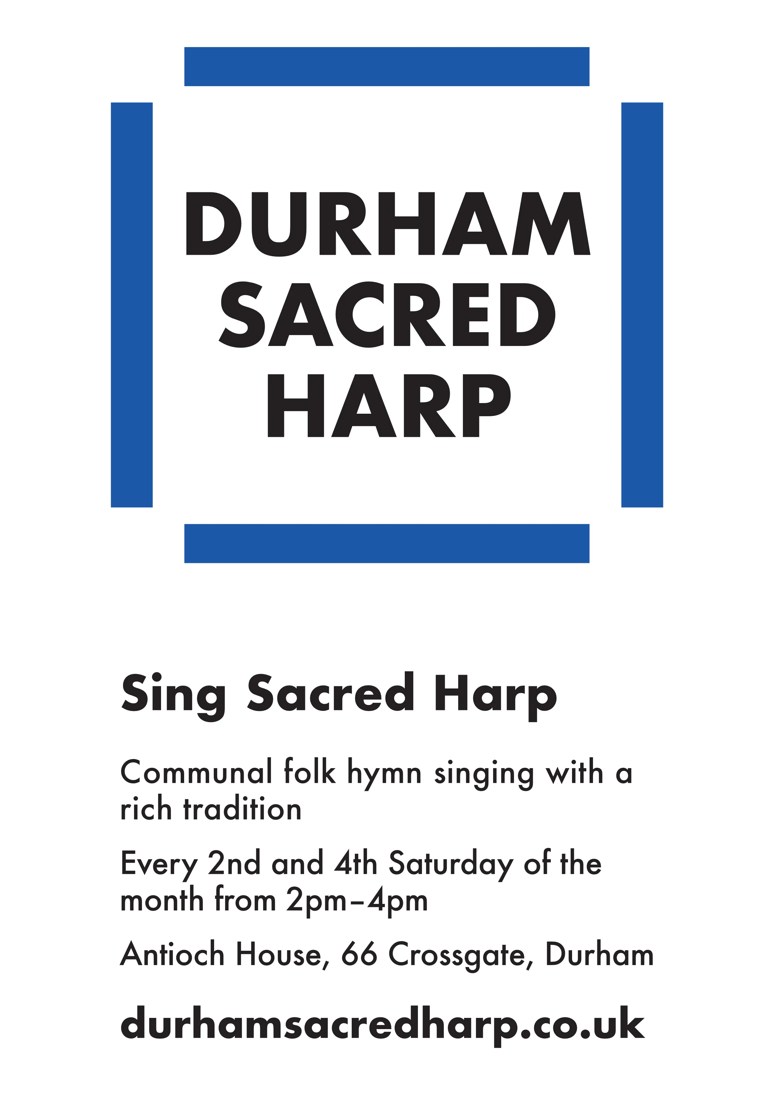
Main poster
This one is very close to the one that I printed up and put around town. There are a couple of small differences. If you haven’t sung Sacred Harp before, then the logo at the top is alluding to the hollow square arrangement that Sacred Harp singers sit in. I’ve tried to prioritise a modern look and legibility of the copy.
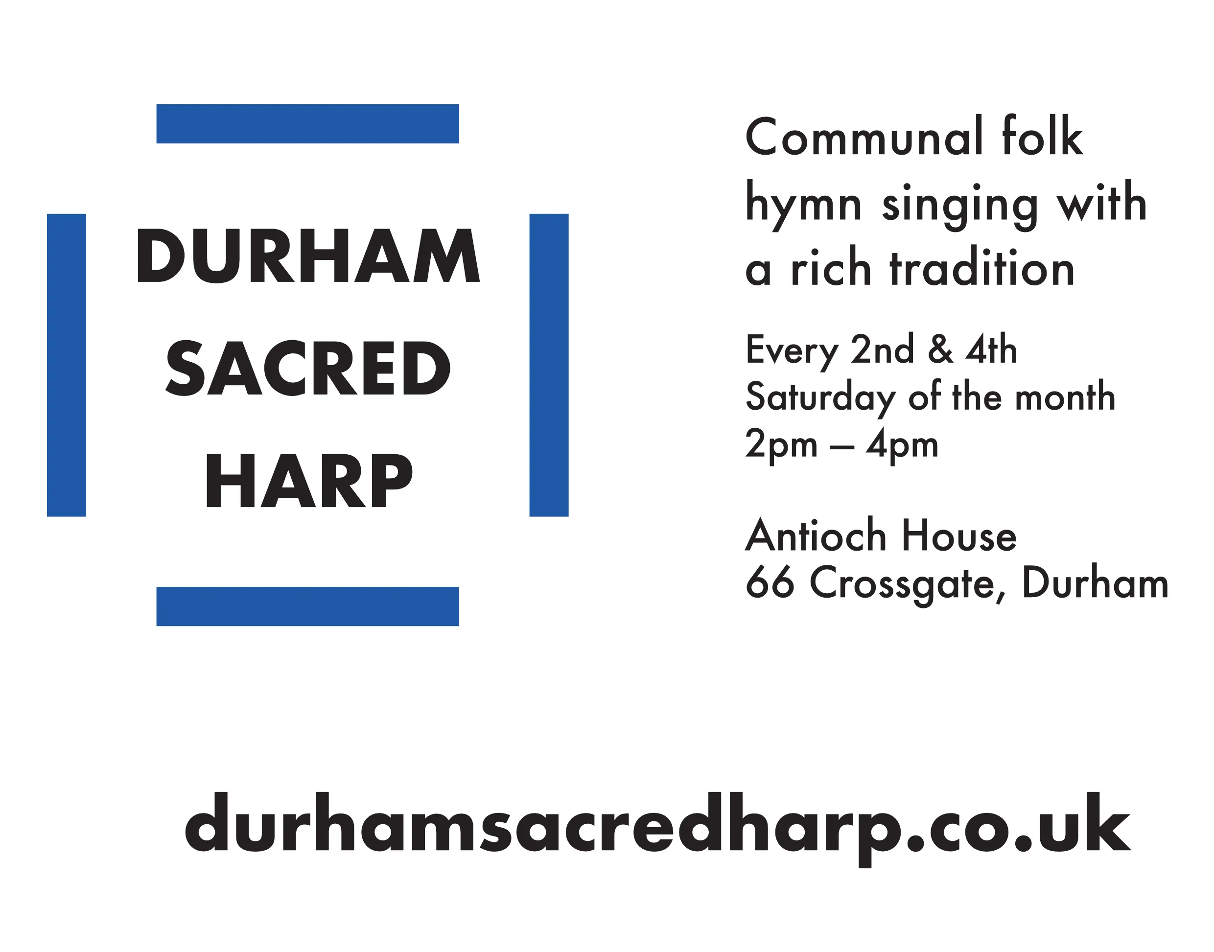
Bookwrap
This is a bookwrap with a similar design made landscape. It wraps around the loaner books we give out to new singers.
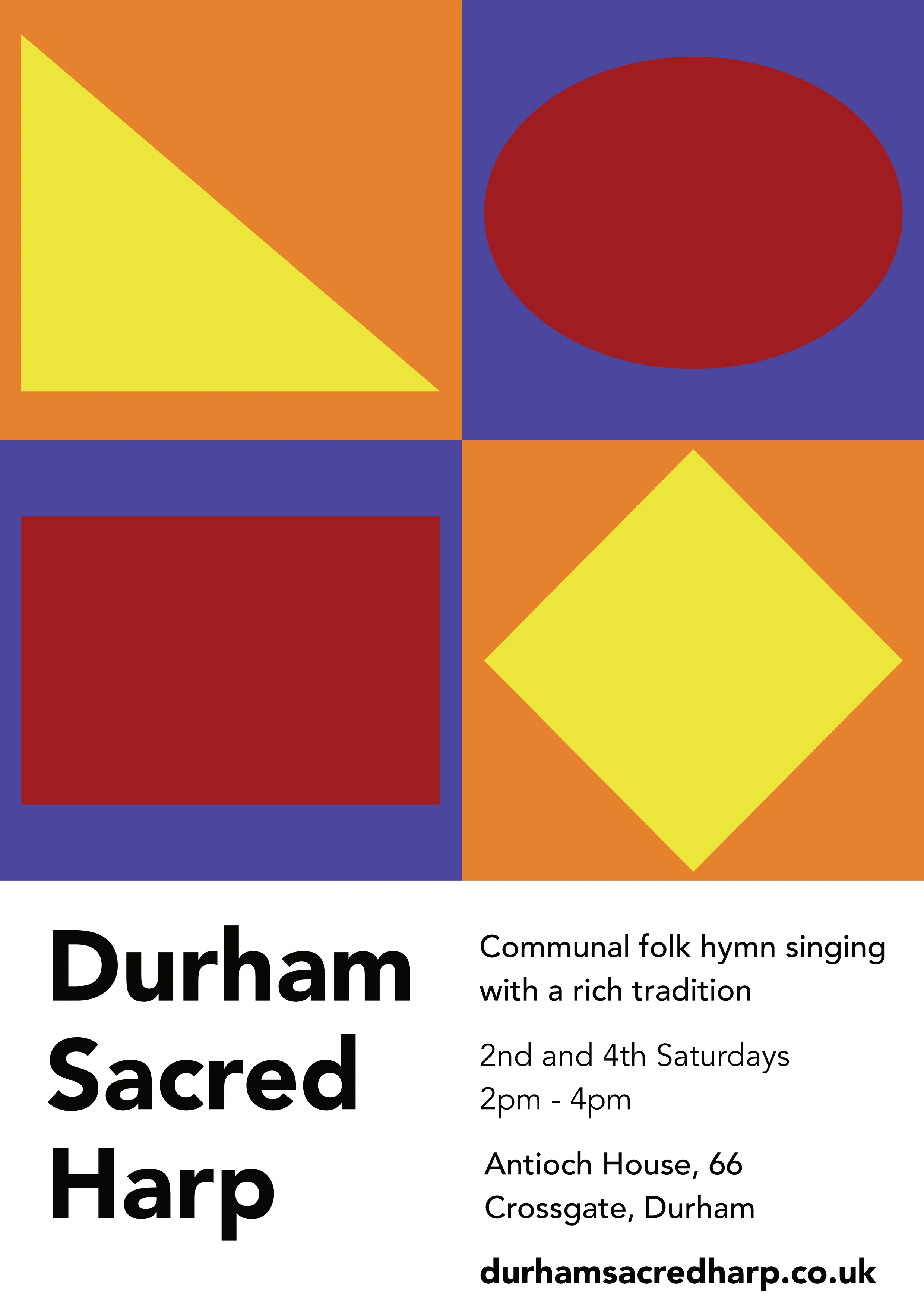
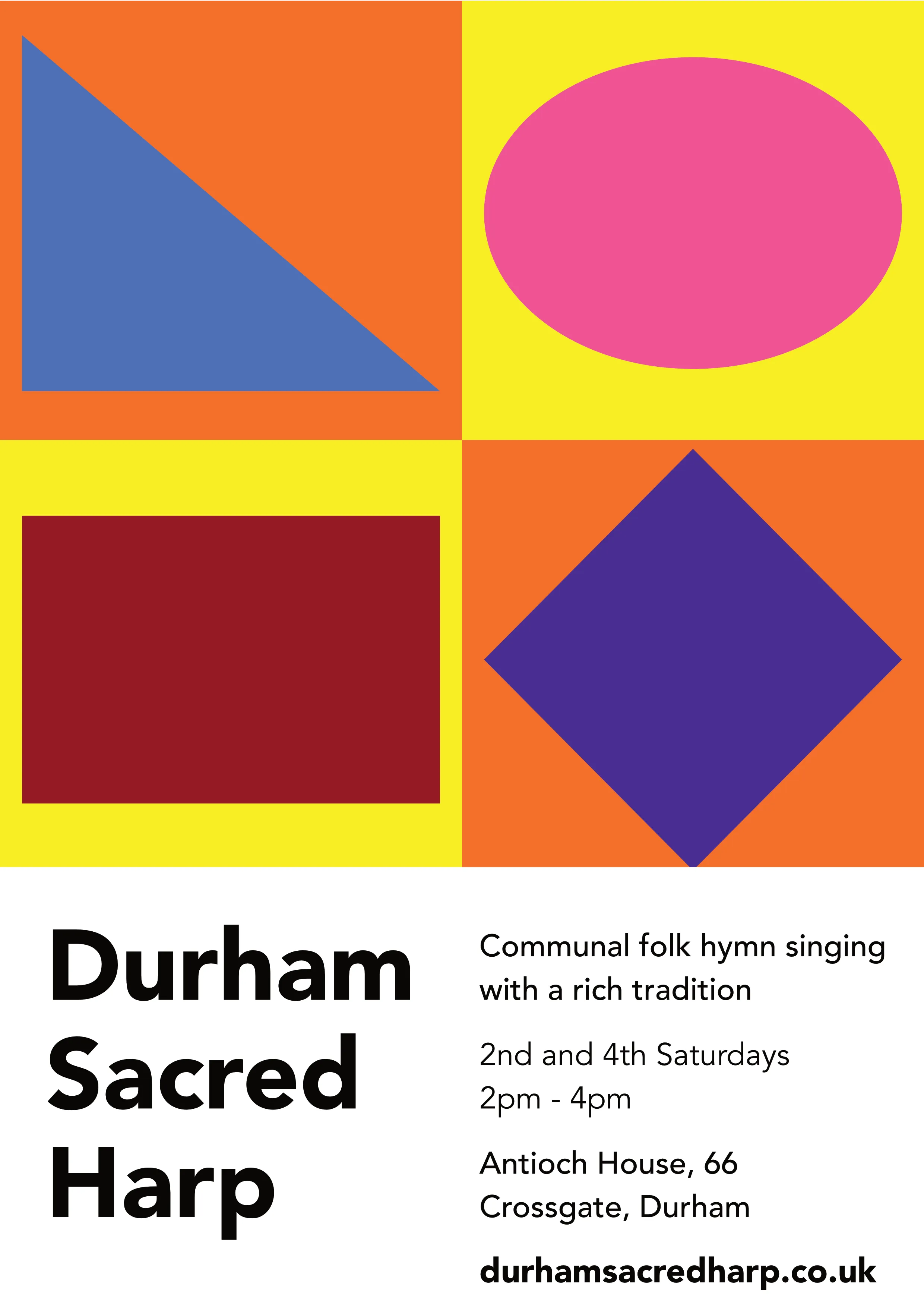
Funky ones
These are a couple of designs that I kind of wimped out of getting printed and sticking up around town. I particularly like the first one. The shapes at the top are from the shapenote notation system that Sacred Harp uses.